I’ve been building a lot of projects using React and TailwindCSS recently, being a big fan of dark mode interfaces, I wanted a simple light / dark switcher for by project. When I went searching I couldn’t seem to find anything simple. So I tried something myself and am fairly happy with the result.
All code for this example can be found on my github
Create the app Link to heading
Create a react app with vite
yarn create vite

✔ Project name: … react-tailwind-themeswitch
✔ Select a framework: › React
✔ Select a variant: › TypeScript + SWC
Install tailwindcss Link to heading
Follow the guide from tailwind site (adjusted for yarn)
yarn add -D tailwindcss postcss autoprefixer
yarn tailwindcss init -p
Configure tailwind Link to heading
Use the config provided from the tailwind site for vite, plus add the darkMode option
/** @type {import('tailwindcss').Config} */
export default {
  darkMode: 'class',
  content: ['./index.html', './src/**/*.{js,ts,jsx,tsx}'],
  theme: {
    extend: {},
  },
  plugins: [],
}
Replace index.css
@tailwind base;
@tailwind components;
@tailwind utilities;
Create a basic layout Link to heading
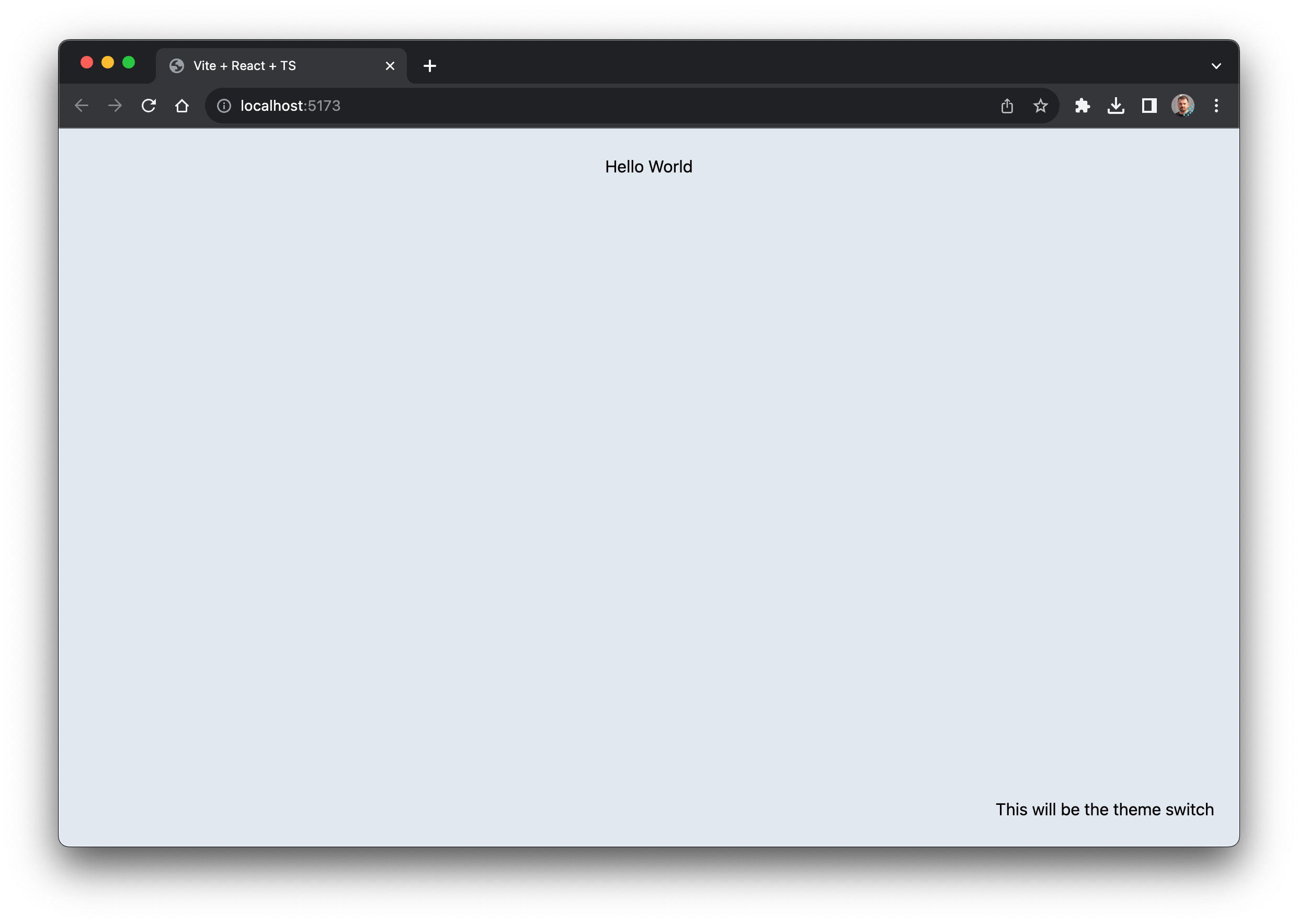
We need a basic layout that supports dark mode, remove the contents of App.css as we won’t be needing them, and replace App.tsx with the following
// App.tsx
import React from 'react'

function App() {
  return (
    <div className='app bg-slate-200 dark:bg-slate-900 h-screen w-full p-6 transition-colors duration-500 ease-in-out'>
      <div className='flex flex-col items-center h-full justify-between'>
        <h1 className='text-slate-800 dark:text-slate-200'>Hello World</h1>
        <div className='self-end'>This will be the theme switch</div>
      </div>
    </div>
  )
}

export default App
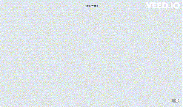
What you should be looking at now
The theme switch component Link to heading
Add a new component in src/ThemeSwitch.tsx, our theme switch adds a couple of dependencies so lets install them also
yarn add @headlessui/react @heroicons/react usehooks-ts
These depedencies provide unstyled accessible components from headless ui, icons from heroicons and common hooks with typescript support.
This switch component itself was from tailwindui.com
// ThemeSwitch.tsx
import { useEffect, useState } from 'react'
import { Switch } from '@headlessui/react'
import { SunIcon } from '@heroicons/react/24/solid'
import { useLocalStorage } from 'usehooks-ts'

function classNames(...classes: string[]) {
  return classes.filter(Boolean).join(' ')
}

function ThemeSwitch() {
  const [theme, setTheme] = useLocalStorage('theme', 'light')

  useEffect(() => {
    document.body.classList.remove('light', 'dark')
    document.body.classList.add(theme)
  }, [theme])

  const [enabled, setEnabled] = useState(theme == 'light')

  const handleThemeChange = (enabled: boolean) => {
    setTheme(enabled ? 'light' : 'dark')
    setEnabled(enabled)
  }

  return (
    <Switch
      checked={enabled}
      onChange={handleThemeChange}
      className={classNames(
        enabled ? 'bg-gray-400' : 'bg-yellow-600',
        'relative inline-flex h-6 w-11 flex-shrink-0 cursor-pointer rounded-full border-2 border-transparent transition-colors duration-200 ease-in-out'
      )}
    >
      <span className='sr-only'>Use setting</span>
      <span
        className={classNames(
          enabled ? 'translate-x-5' : 'translate-x-0',
          'pointer-events-none relative inline-block h-5 w-5 transform rounded-full bg-white shadow ring-0 transition duration-200 ease-in-out'
        )}
      >
        <span
          className={classNames(
            enabled
              ? 'opacity-0 duration-100 ease-out'
              : 'opacity-100 duration-200 ease-in',
            'absolute inset-0 flex h-full w-full items-center justify-center transition-opacity'
          )}
          aria-hidden='true'
        >
          <SunIcon className='h-3 w-3 text-gray-400' />
        </span>
        <span
          className={classNames(
            enabled
              ? 'opacity-100 duration-200 ease-in'
              : 'opacity-0 duration-100 ease-out',
            'absolute inset-0 flex h-full w-full items-center justify-center transition-opacity'
          )}
          aria-hidden='true'
        >
          <SunIcon className='h-3 w-3 text-yellow-600' />
        </span>
      </span>
    </Switch>
  )
}

export default ThemeSwitch
Lets walk through whats happening
We are using local storage to persist the setting for light or dark mode
const [theme, setTheme] = useLocalStorage('theme', 'light')
We’re setting the body class to dark or light based on the setting
  useEffect(() => {
    document.body.classList.remove('light', 'dark')
    document.body.classList.add(theme)
  }, [theme])
We are keeping the state of the button toggle being on or off separately to the light dark
  const [enabled, setEnabled] = useState(theme == 'light')

  const handleThemeChange = (enabled: boolean) => {
    setTheme(enabled ? 'light' : 'dark')
    setEnabled(enabled)
  }
Integrate the component into the view Link to heading
Finally we just need to update App.tsx
import React from 'react'
import ThemeSwitch from './ThemeSwitch'

function App() {
  return (
    <div className='app bg-slate-200 dark:bg-slate-900 h-screen w-full p-6 transition-colors duration-500 ease-in-out'>
      <div className='flex flex-col items-center h-full justify-between'>
        <h1 className='text-slate-800 dark:text-slate-200'>Hello World</h1>
        <div className='self-end'>
          <ThemeSwitch />
        </div>
      </div>
    </div>
  )
}

export default App
And thats it, we now have a simple theme switcher